10 E-Commerce UX Tips to Optimize Filtered Navigation
Filtered navigation is a popular website feature that these days is routinely used on e-Commerce sites. It serves the purpose of helping customers find the product they're looking for in large data sets.
Think of the filters you can set for a product search on eBay or Amazon, such as the category, the material, or the brand of a product.
If you want a converting online store, having a filtered navigation is almost a necessity, not just because it facilitates on-site navigation, and speeds up search, but also because online customers have already got used to it on big e-Commerce sites.
1. Choose the optimal place
On most e-Commerce sites, filtered navigation is placed on the left sidebar next to the content, like you can see it on Amazon or eBay. However it's not always the best choice.
Baymard Institute's usability research on filtering found that a horizontal navigation placed on top of the content can perform better in many cases.
Horizontal navigation usually works well for e-Commerce websites that have fewer product filters, as this way users are less likely to overlook the filters.
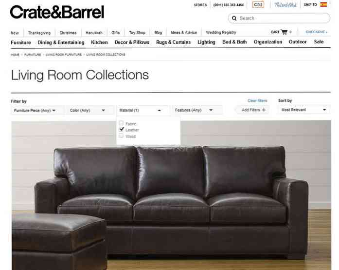
It's always worth testing where to place the filtered navigation, as there can be big differences between conversion rates. The website of Crate&Barrel, a furniture and home decor retailer provides a nice example for a horizontally placed filtered navigation.
2. Provide relevant filters
Although it's worth checking out the filters your competitors use, filters should always be relevant to your products and your audience, and no one else's. It's not always as easy as you'd first think, as you need filters that answer the questions customers ask when they're looking for your products.
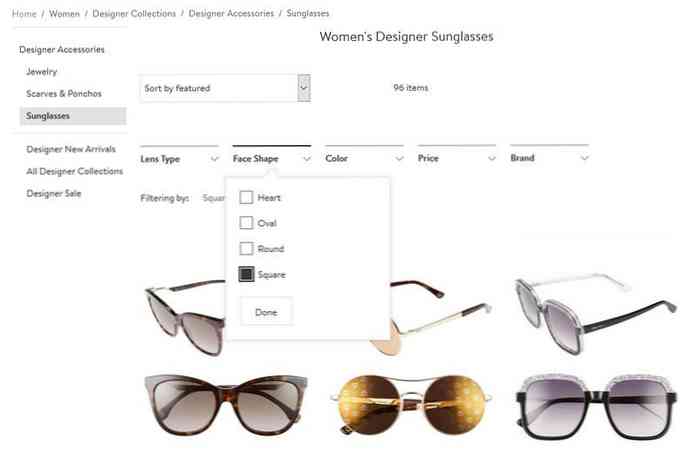
For instance, Nordstrom provides their customers with carefully selected filters for each product category, such as “lens type”, “face shape”, “color”, “price”, and “brand” for sunglasses.
3. Let customers select multiple filters
Although some users just randomly browse your site, many of them arrive with clear-cut ideas and well-defined needs. This customer group usually wants to use multiple filters at the same time in order to run a query simultaneously for different qualities, such as color, price, and material.
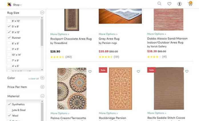
It's not only necessary to let them select different filters from multiple filter groups, but also of the same type. The Wayfair online home store provides a professional user experience by allowing their customers to search for as many filters as they want.
4. Enable manual input when necessary
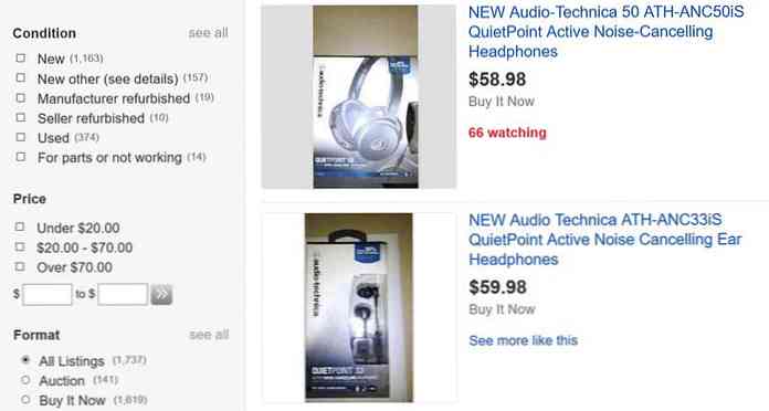
Checkboxes are a great way to fetch filter values, but sometimes it's also a good idea to let customers set filters manually, such as in the case of price input fields. Each customer looks for products in a different price range, so it's not always easy to properly preset price filters.
eBay has a price filtering UI that serves two customer groups at the same time: those who are okay with quickly ticking a preset price range, and those who rather choose their own minimum and maximum prices, and type them manually into the provided text input fields.
5. Display a product counter
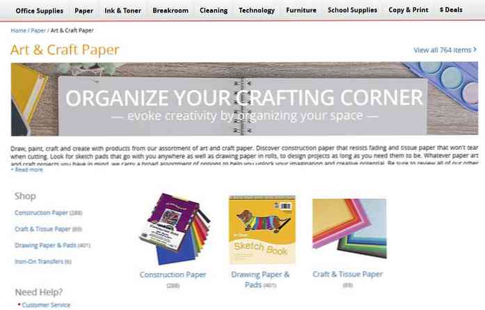
By displaying a product counter, you don't only keep your customers well-informed which naturally creates a sense of trust, but also let them know how “well” they performed with their filtering efforts. Each customer has a number of product they want to check out before a purchasing decision. Ideally, filtering brings them close to this number. If you provide them with a product counter they immediately know if they set enough filters or need to rerun the query.
It's important to show how many products belong to a certain filter configuration on every e-Commerce site. Office Depot takes this feature to the next level, and displays a product counter next to each available category, that gives a natural push to customers to move on with their product search.
6. Create filter groups that make sense
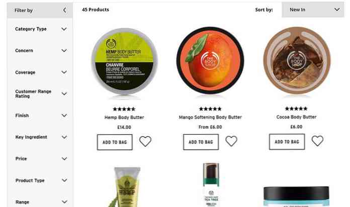
On a well-converting e-Commerce site it's a must-have to provide customers with all the filters they need to make a responsible purchasing decision-this is especially important if you market premium products. To keep the filtered navigation neat and user-friendly, it's crucial to group the filters in a way that makes sense.
The online store of The Body Shop has probably a little bit more filters that would be necessary but as the filters are well-grouped, the user experience is not broken by superlong and inscrutable filter lists.
7. Make filter groups toggleable
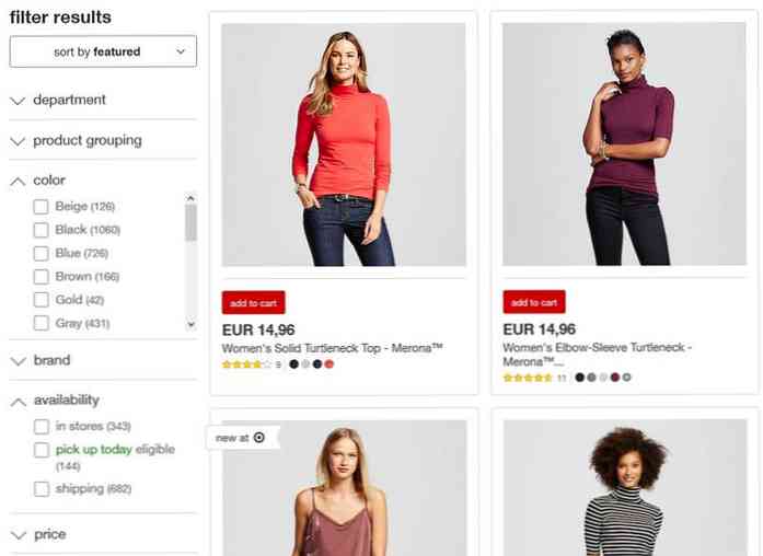
If you have too many options, it's worth considering to make filter groups toggleable to allow users to quickly open and close the different groups. It's also a good solution for mobile layouts, as on small screen filtered navigation can get way too long, even to the dreaded point of non-usability.
The filtered navigation of Target uses the well-known pattern of up and down arrows to indicate toggleability, moreover when the filter list inside a group gets too long (such as in case of colors), a scrolling bar is added as well. Both of these features enhance mobile usability.
8. Consider thematic filters
Thematic filters are a distinct kind of product filters that help customers run queries based on different themes that respond to frequent requests, such as “summer arrivals”, “on sale”, “casual style”, or “last-minute deals”. Baymard Insitute's usability researches summarized on Smashing Magazine found that thematic filtering is not always utilized even on big e-Commerce sites.
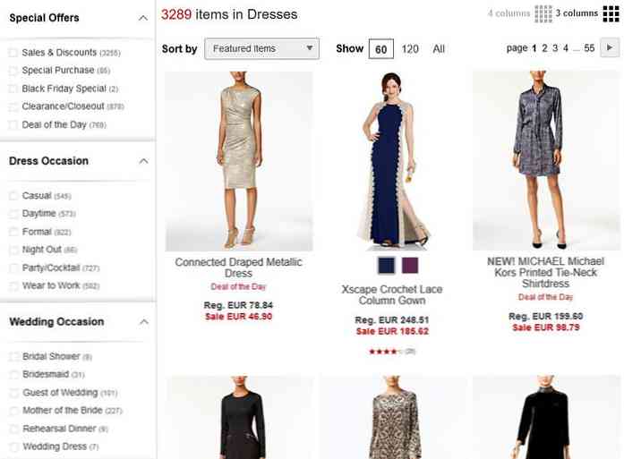
It's always worth considering if there are any thematic filters you can use in your own store. Macy's can be a good example for a nuanced filtered navigation. In the “Dresses” category, it offers filters for carefully selected themes, such as “Special Offers”, “Dress Occasion”, and “Wedding Occasion”. If you want to read an in-depth analysis on Macy's filtering UI check out this research.
9. Display applied filters
As many people tend to forget what they've just searched for, displaying the filters they've applied next to the query results is a feature that can significantly improve user experience. This way your customers will feel less lost, as they can check at any time the filters they selected earlier, and modify them when it's necessary.
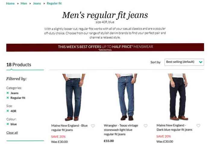
Debenhams doesn't only show the applied filters on top of the filtered navigation, but also groups them when multiple filters are applied-providing even a more eye-catching visual cue.
10. Display popular filters on top
Each e-Commerce site has its popular themes, such as a trend, a season, or a special offer. You can apply a thematic filter for each of these themes, and place it on top of the filtered navigation in order to help your customers find them.
If you want to be even more professional, you can change your popular filters over time, based on the changing patterns of customer habits on your site.
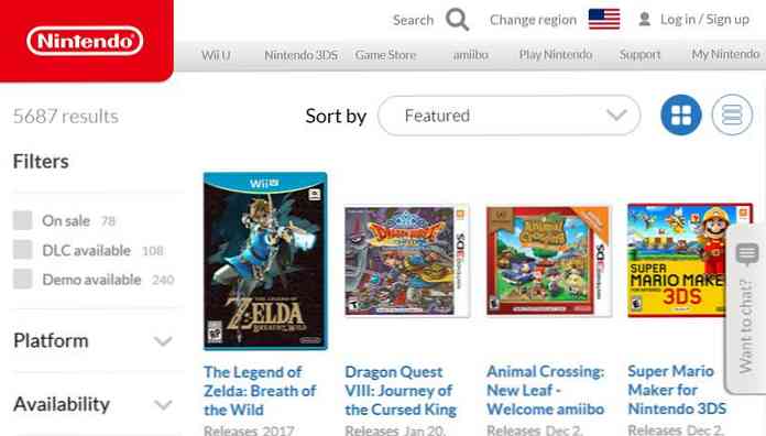
The Nintendo Game Store currently provides three popular filters, “On Sale”, “DLC available”, and “Demo available”, and displays them on top of all other options to tempt even hesitating users to run a quick query that only cost a very minimal effort.


